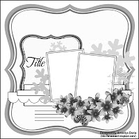
When creating layouts, people typically chose the photo first and then build around it. Since I hate to be "normal", I quite often chose the paper first and then decide what works best with it. And such was the case with this layout. I had a very old set of Valentine papers that I pulled out last week with the plans to make a card but couldn't find the mojo and so the papers sat on my desk. But then along came Rochelle Spears' color challenge along with the monthly sketch over at Grand Diva's Creative Corner and I was set! So out came my un-scrapped photos to find an appropriate photo. While the quality of the one photo wasn't great (even after Photoshop), I liked the green in my daughter's shirt and the rest just fell into place (for once), including the title which was inspired by Kerys' Scrappin' Happy WordArt challenge. I'm probably most pleased that everything came from deep in my stash from cardstock to the the year-old flowers and the even older Thickers.
Title - Thickers (Vera and Daiquiri)
Flowers - K&Company
Date alphas - Lilly Bee Designs


Lisa another great layout! Love how you switched up the diecut shapes! Awesome take on all 3 challenges! Thanks for playing along at GCC as well as in my scrappy friends challenges!
ReplyDelete